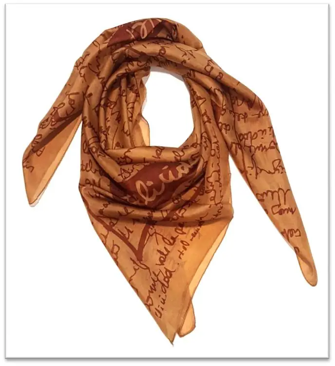
Where should a logo go on a silk scarf?
A logo on a silk scarf usually goes in one corner or along the border, where it stays visible when the scarf is tied. A small logo in an all-over repeat gives a subtle, brand-led look.
How do the silk options for a logo scarf compare?
For silk scarves with a logo, the table below sets it out. From 3 m at 44-inch, cut at 92 cm. Weights are typical, per scarf.
| Silk | Typical weight | From 3 m | Result on the cloth |
|---|---|---|---|
| Silk twill | 12-16 momme | 3 | Very sharp detail and rich colour |
| Silk satin | 16-22 momme | 3 | The most luminous colour we print; the sheen deepens dark shades |
| Silk crepe | 12-16 momme | 3 | Soft, rich colour without glare |
| Silk habutai | 5-16 momme | 3 | Deep, glowing colour; fine detail stays sharp on the smooth weave |
Which silk suits a logo scarf?
Silk twill suits a logo scarf with small text, because its smooth face keeps fine edges sharp. Silk satin gives more shine, and silk crepe suits softer shapes rather than tiny type.
How should a silk scarf logo file be supplied?
A silk scarf logo works best as a vector file, in PDF or AI with fonts outlined. A photo of a logo will print soft, and brand colours should be checked on a printed sample.